
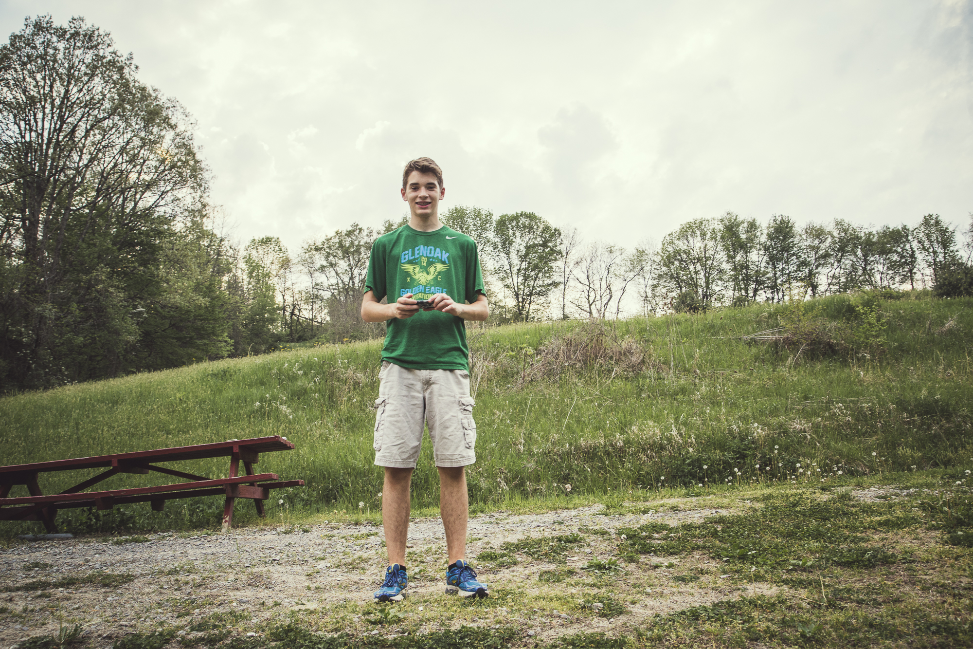
Senior Photos Don't Need To Be Cheesy
Why stick with traditional Senior portraits?
Senior photos. I remember the days when everyone passed around their wallet-sized prints and wrote a note on the back for each of their classmates.
I also remember at least half of the images were taken by a "quantity over quality" type studio, where they put the Senior in the same sitting position that they have for the last 340/340 Seniors. Each portrait is the same type of shot, the same tilt of the head, and about 20 variations of the same pose.
Now stop. If you're a photographer reading this, you're already frustrated, and if you're a Senior or the parent of a Senior, please pause and answer this question... Why in the world would you like to remember your/your child's last year of high school- this huge milestone of your/their lives- by these cheesy portraits that look like everyone else?
As an artist, I get bored of the same old work, whether I am the one creating the work or watching others create the same old work, I just get plain tired. And so I'm tired of Senior Portraits for what the majority of people find them to be, just another checkmark on their list before graduation; I'm tired of the redundancy and the traditional posing, lighting, the godforsaken same backgrounds that just are not natural in any world (please search "cheesy photo backdrops" for plenty of examples), and for the lack of better words- I'm tired of the lameness and the artificial, insincere personalities that Seniors are offered in these "quantity over quality" studios. Senior portraits are about YOU, the Senior, and should be personalized to your style and your interests.
Senior photos don't need to be cheesy. Senior photos should be a memorable experience and a fun way to show and record for your children, your children's children, and even for you to remember who you are here and now.
And for the record, I believe in the "QUALITY over quantity" argument of photography.


Behind the scenes


Live by faith & share through fotos.
Print Portfolio
My print portfolio case by Shrapnel Design & my final selected portfolio images.
As you may know, I graduated at the end of June this past year from The Art Institute of Pittsburgh. In order to graduate, one of the requirements was to show a print portfolio to the faculty and at the Portfolio Show. This portfolio book is also a tool to show potential employers your work that may not be displayed directly on your website portfolio, but is still consistent in style. The portfolio includes my best work created up until graduation, along with an artist statement. It is a difficult self-assignment because of all the decisions that need to be made, and in a timely fashion. These decisions include what type of case, plastic sleeves or no plastic sleeves, what type of paper to print on if you are printing yourself, choosing which images show your overall and consistent style; from there, the layout of the images on the page, and many more technicalities. A lot of time and thought went into this print portfolio, although all the prep work goes unseen.
I chose to order my white aluminum case from Shrapnel Design and use plastic sleeves to protect the prints. My portfolio is 11x17 in order to show the closest crop size as possible to the originals, and printed at full bleed. The average number of images in a portfolio should be about 15-25 and display your technical skills and creative ability, in a consistent manner that reflects your branding. An artist statement about my work is displayed before the images. The cover of my portfolio reflects the watermark that I use for social media which "Faith Through Fotos" printed at the bottom.
So here it is, my artist statement (able to be clicked on to read more easily) and my print portfolio from this past year!


Live by faith & share through fotos.

On Veterans Day
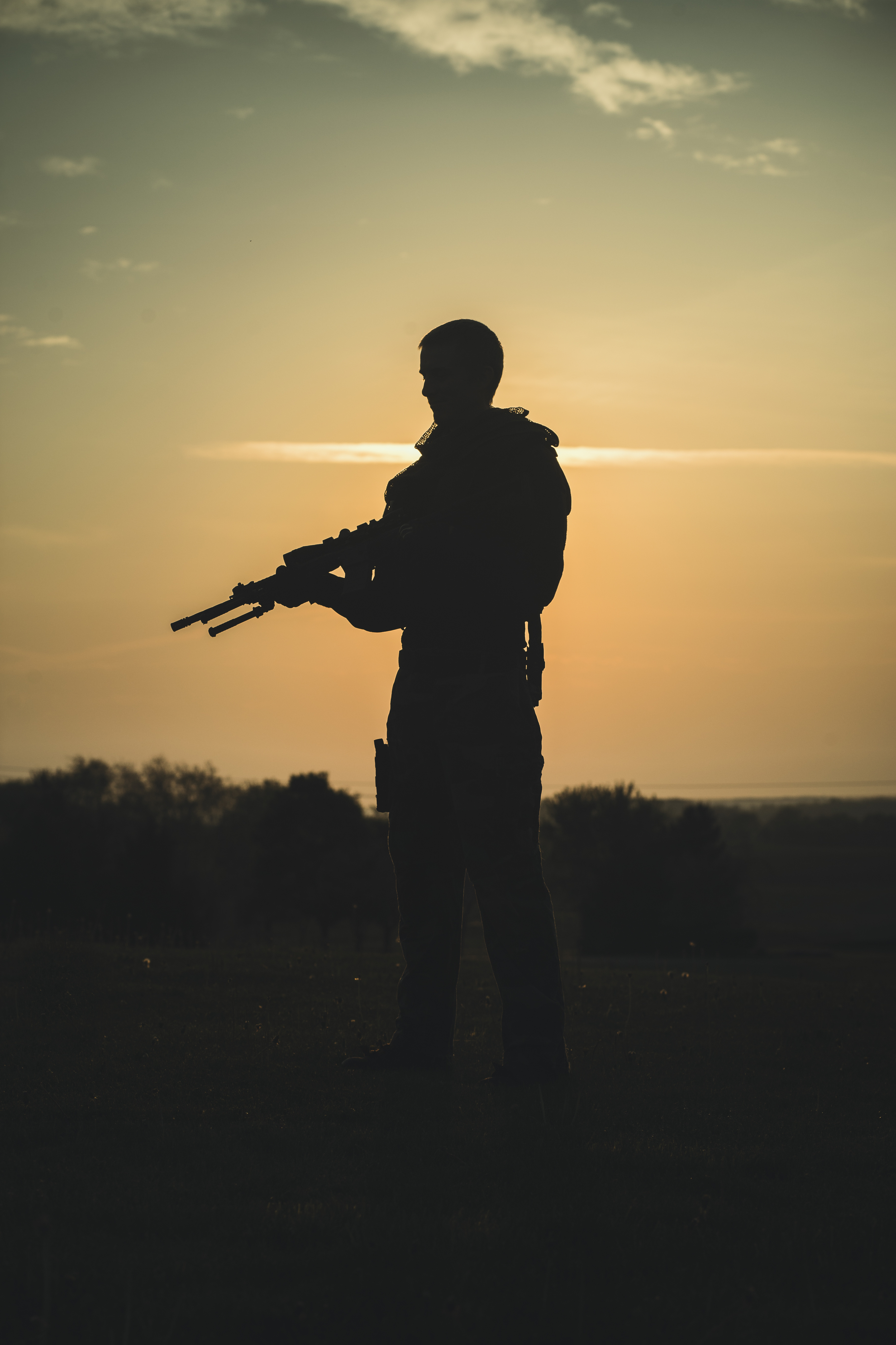
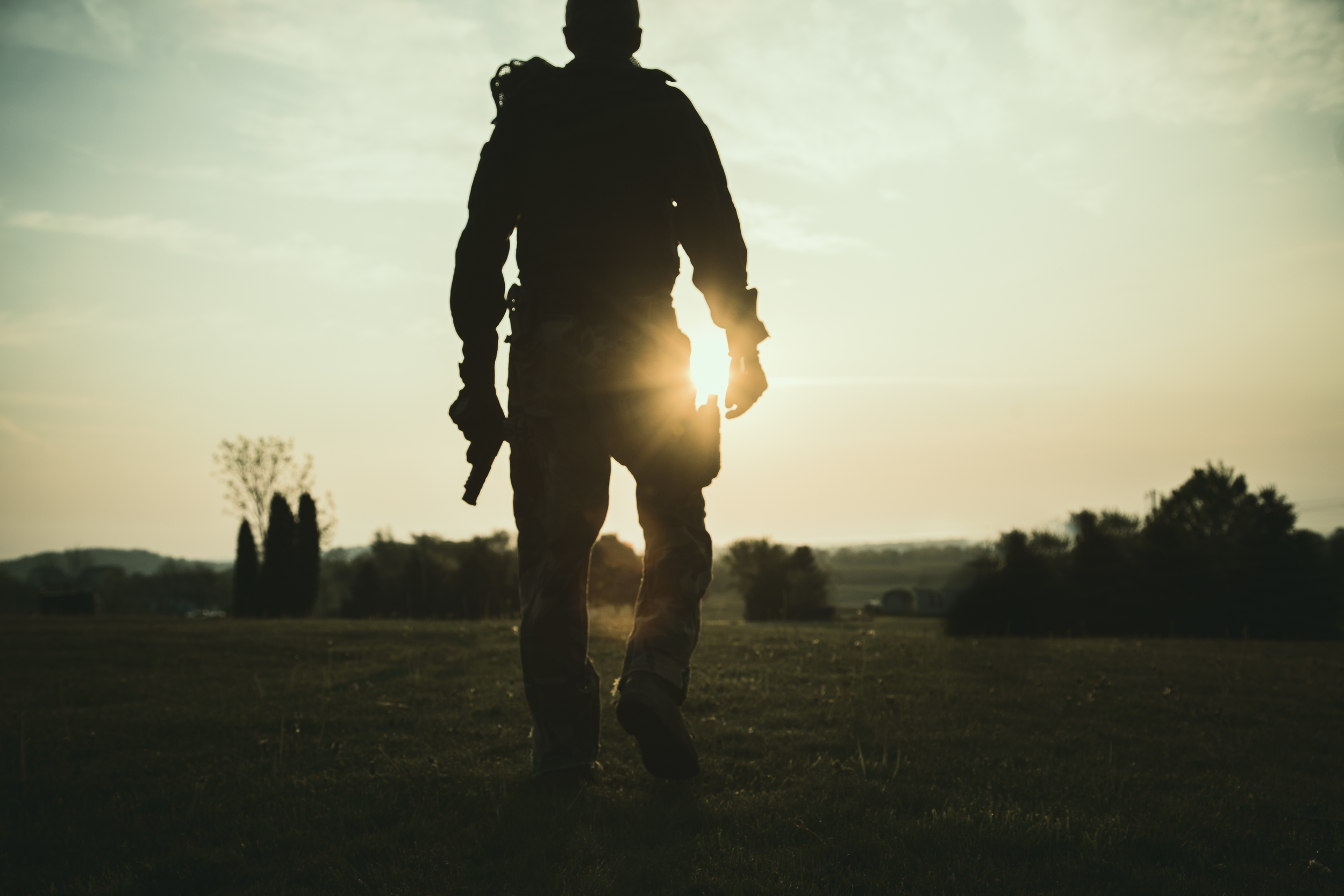
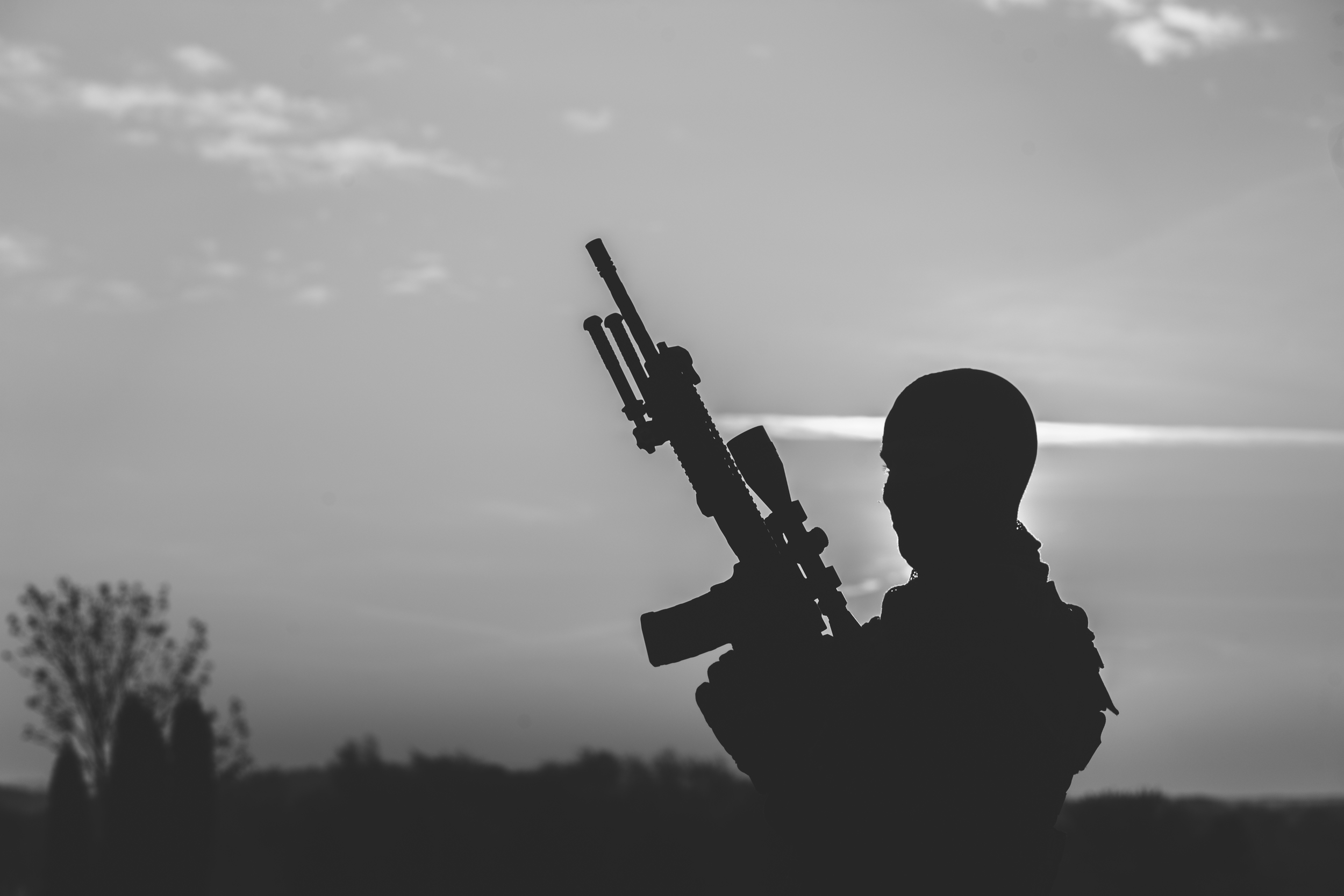
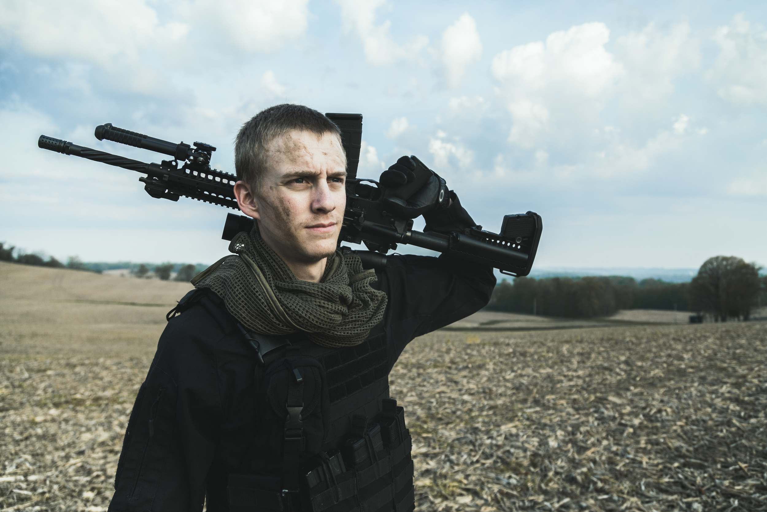
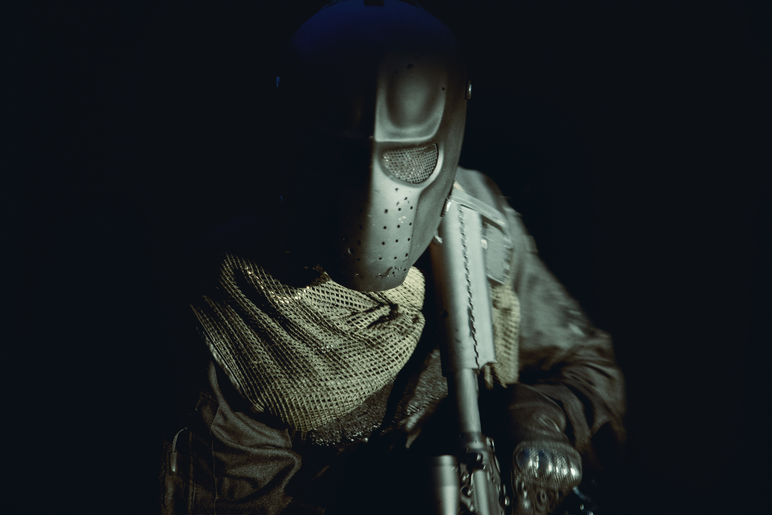
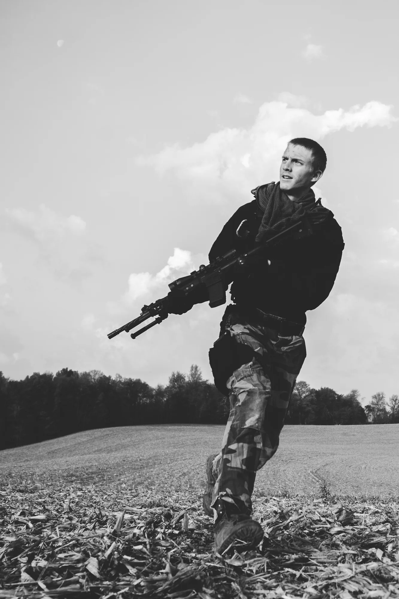
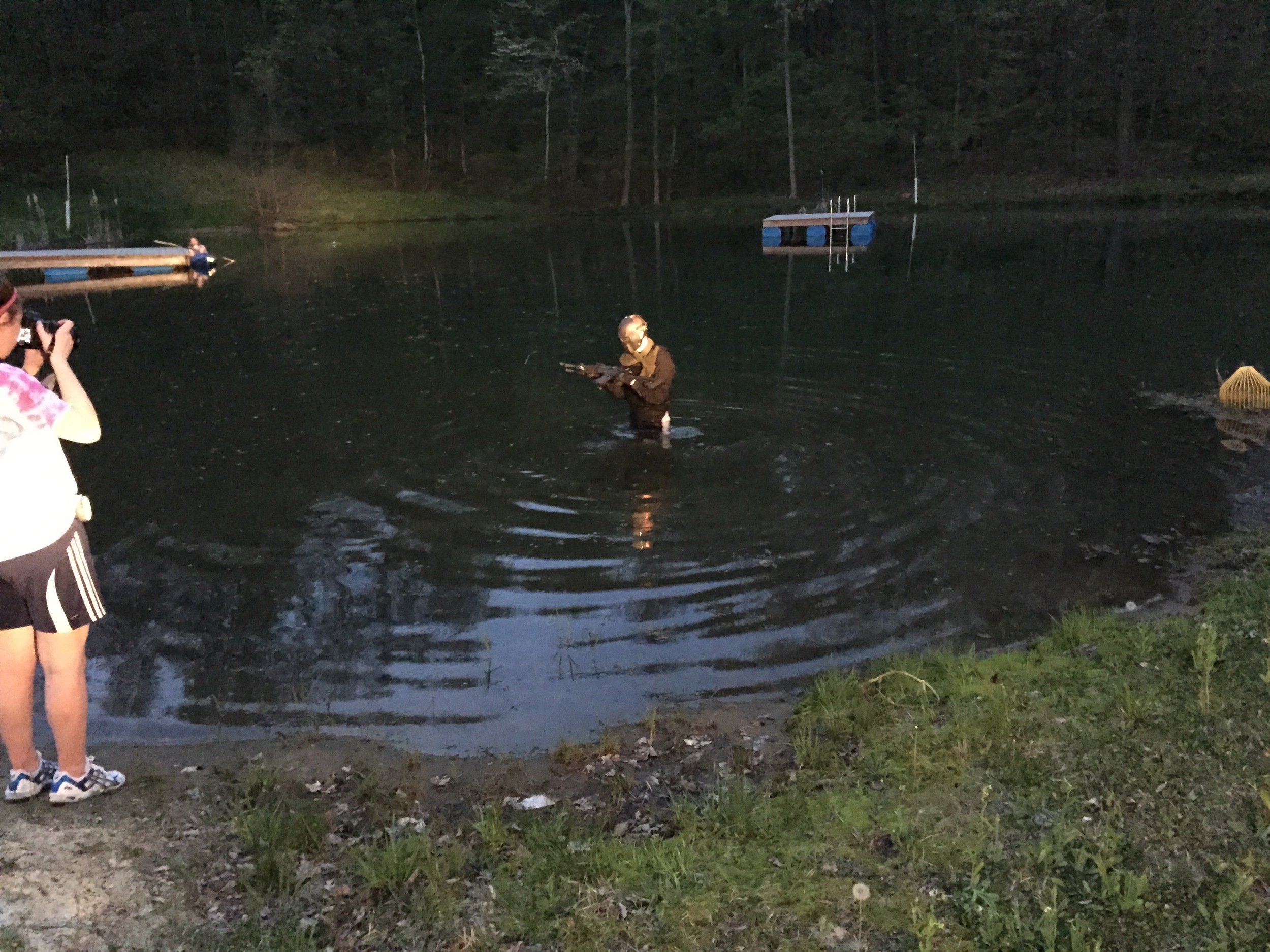
Final images from my shoot inspired by Call of Duty, with behind the scenes and before and after images.

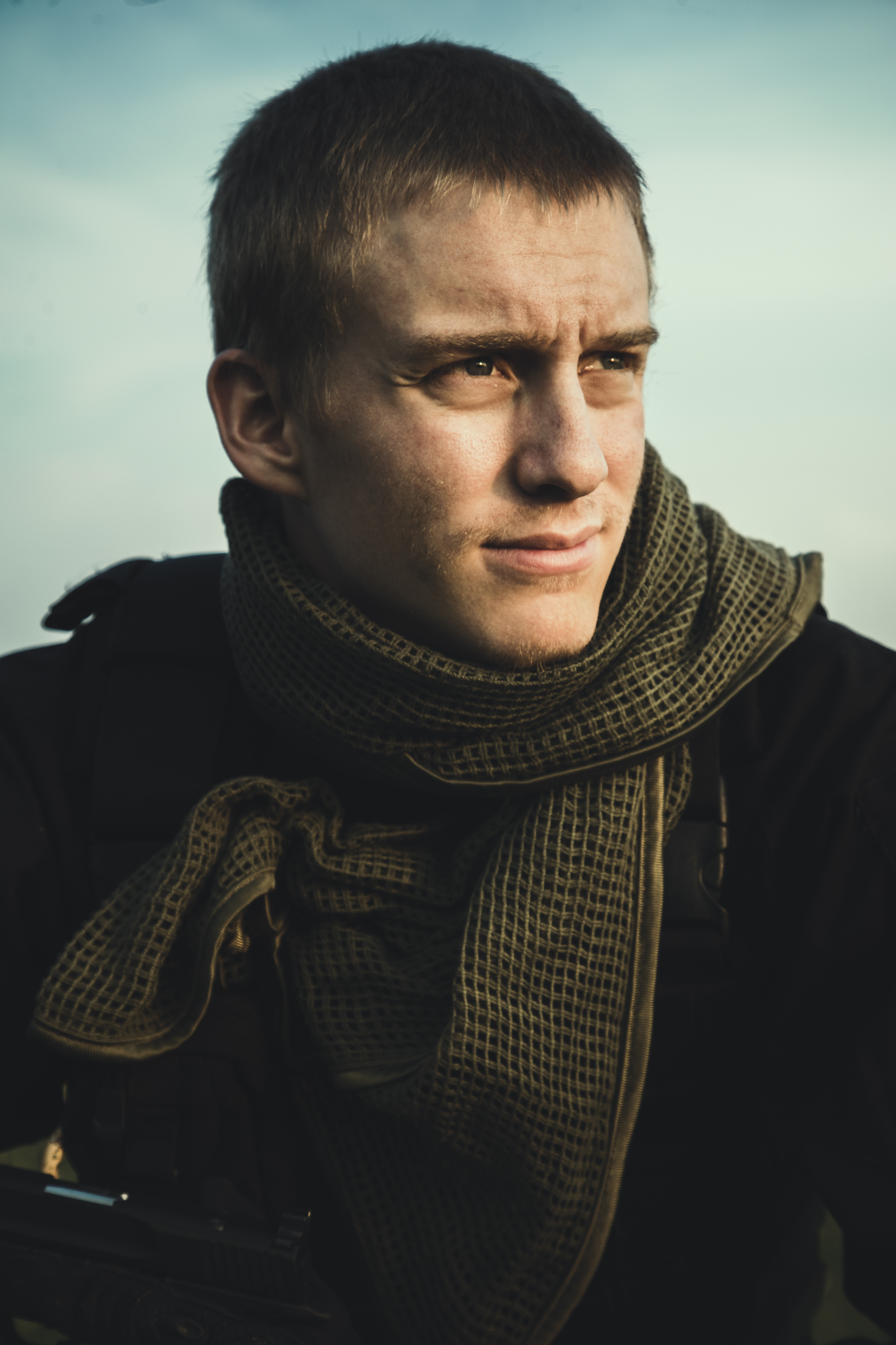
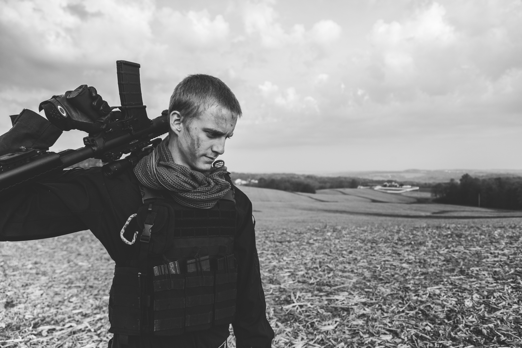
Final image from Collin's shoot used for my print portfolio.
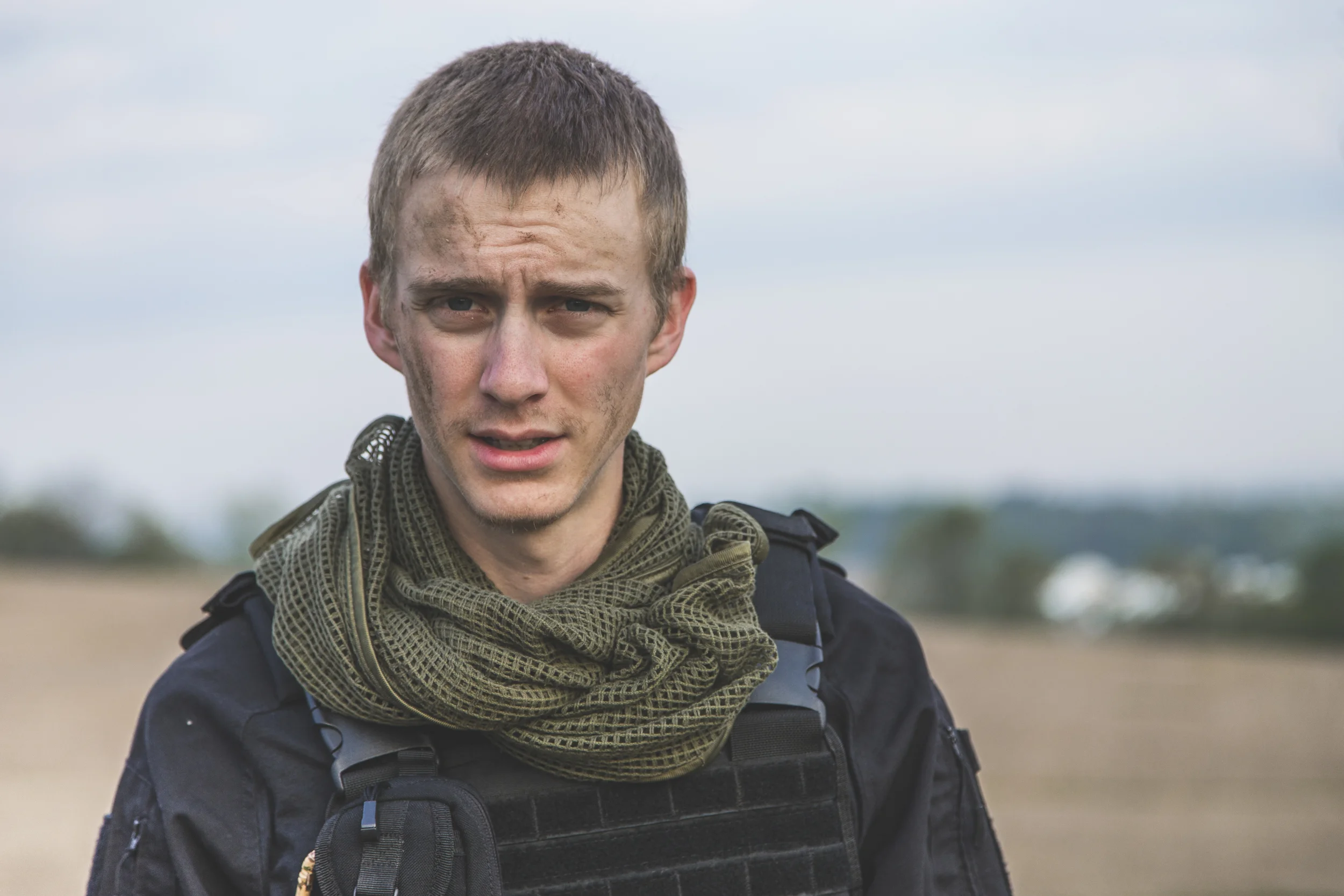
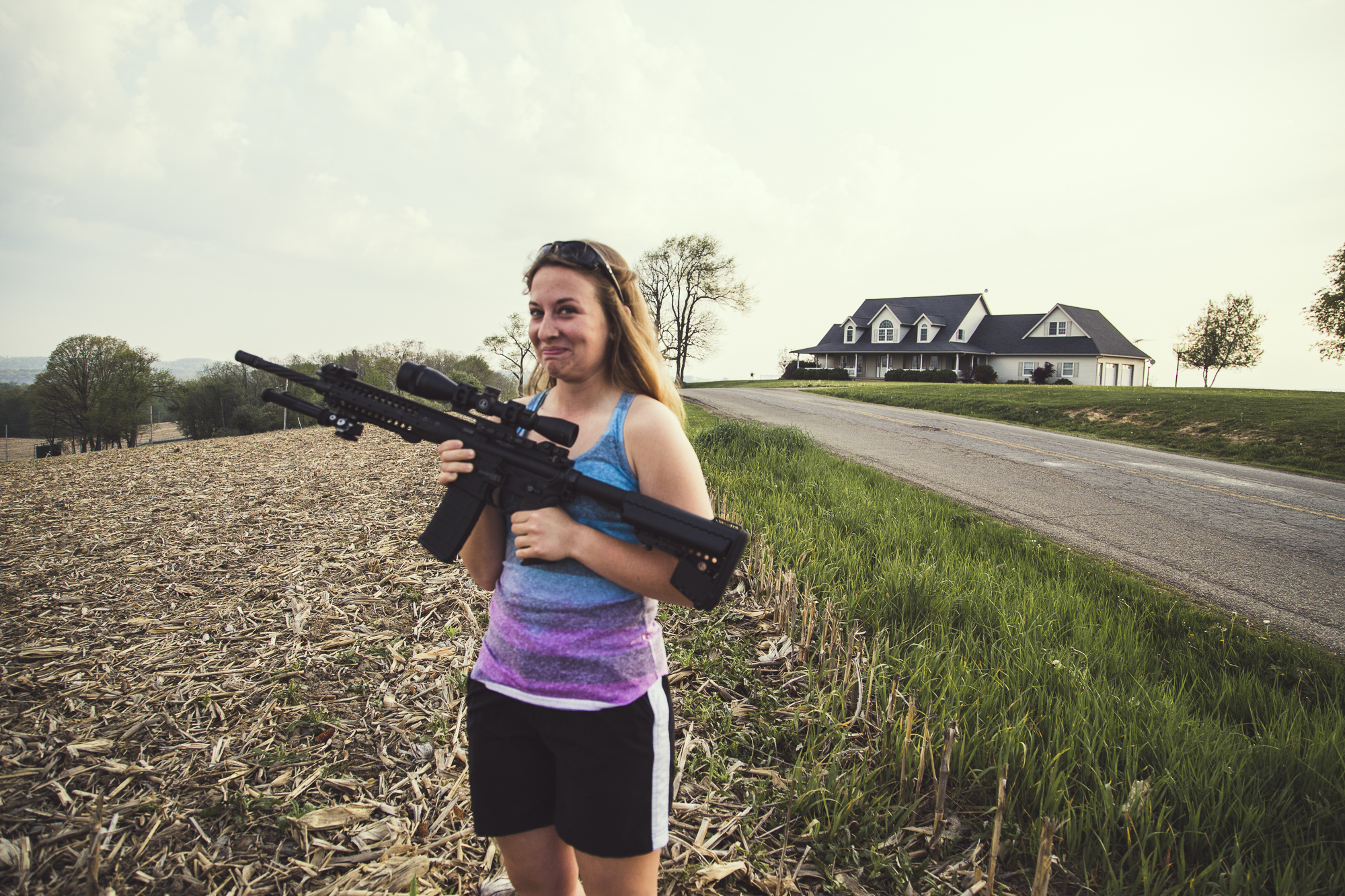
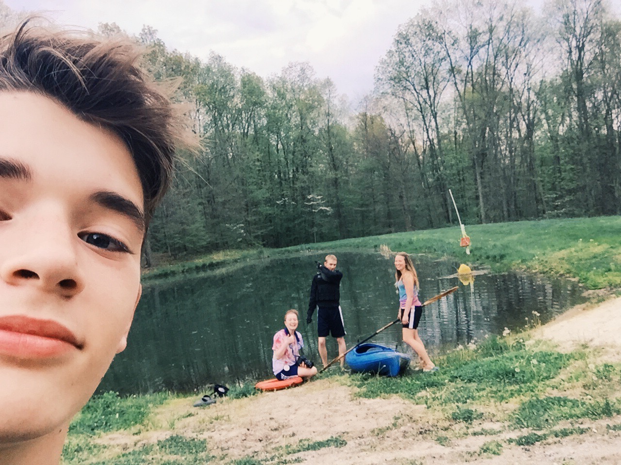
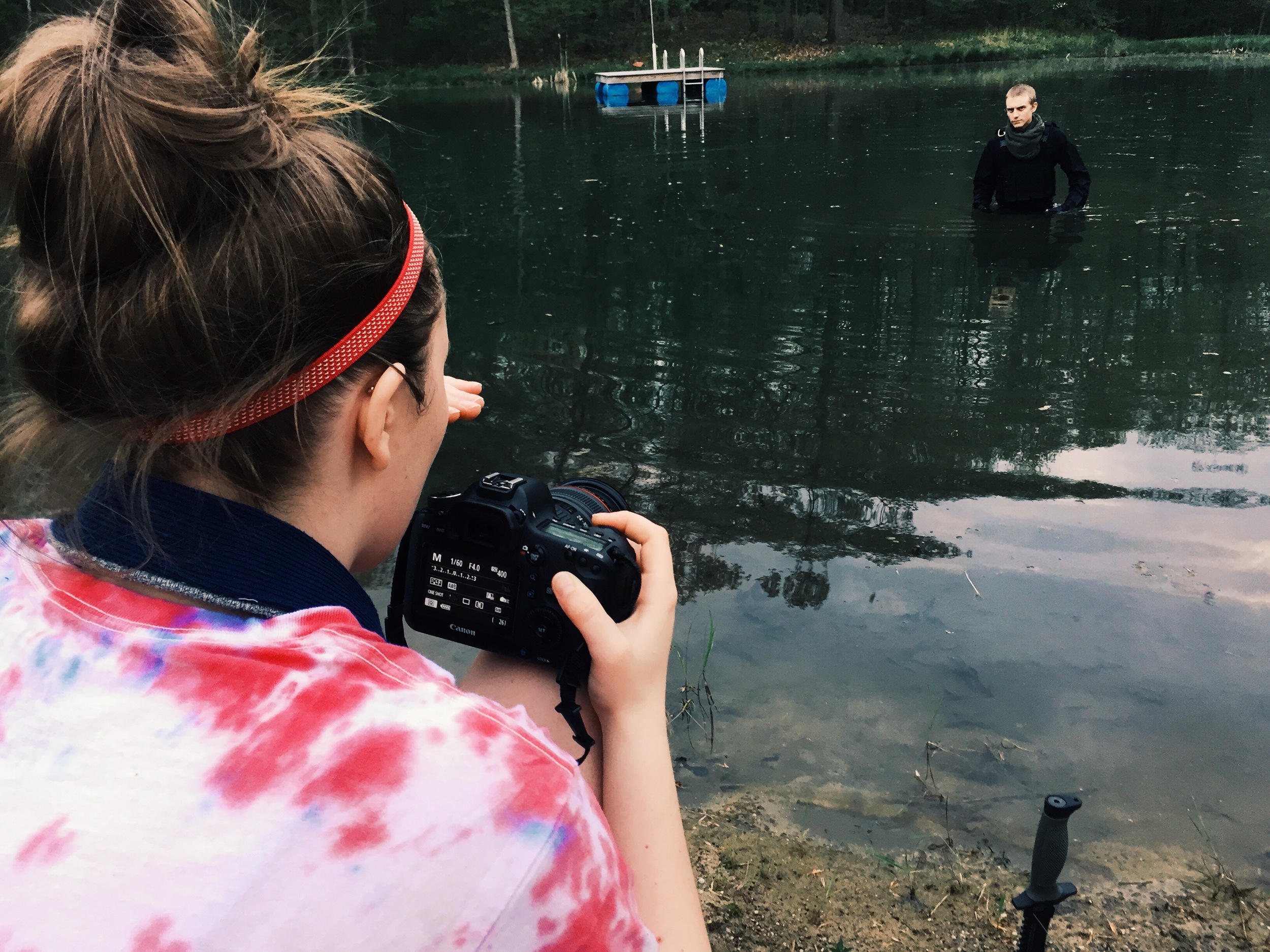
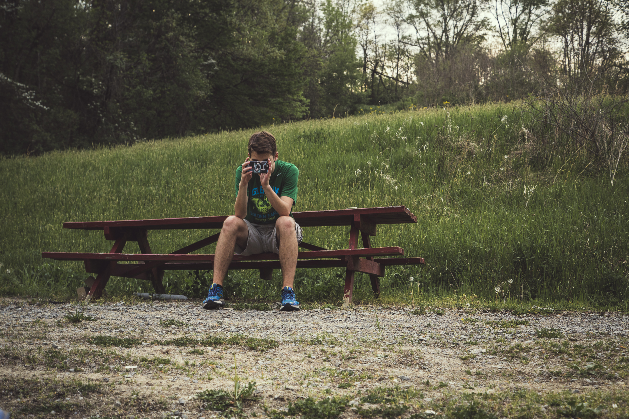
My inspiration for this shoot originally came from Call of Duty. My brothers used to be in love with the game, and gosh darn it, their promo photos are so good. Google Image search "Call of Duty" and you will agree completely. Plus, my friend Collin has been wanting to do a shoot for quite some time using all of his airsoft gear. We did the shoot in two sessions, one at sunrise and one at sunset, which makes for a pretty long day, but the crew had a nice long break for naps between. The team included Collin Galbraith as the model, Chelsea Black and my brother Jonathan Schonauer as assistants.
Although this was a personal project inspired by a video game, on a serious note, I'd like to dedicate these images to all the Veterans that have served our country. I take every thing I have for granted on a daily basis, forgetting the freedoms that I have, thanks to the brave American troops this country has, and our Awesome God. I debated sharing these images on Veterans Day because I didn't want them to be "offensive" in any way to make military or war look "easy" or "pretty" with all the Photoshop and setting up this shoot took. And I hope that that message doesn't get passed on through the images. I want these photos to represent the soldiers as individual people and be a reminder of the incredible sacrifice they have made. It's not much, but I just want these images to say "Thank you!".
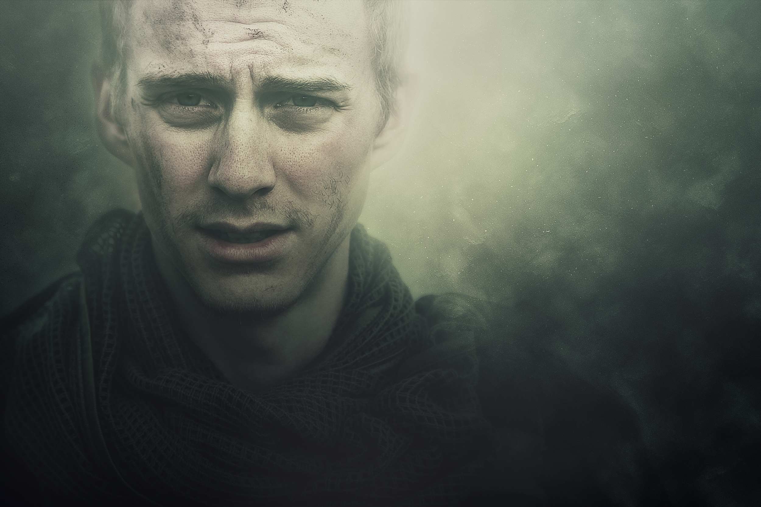

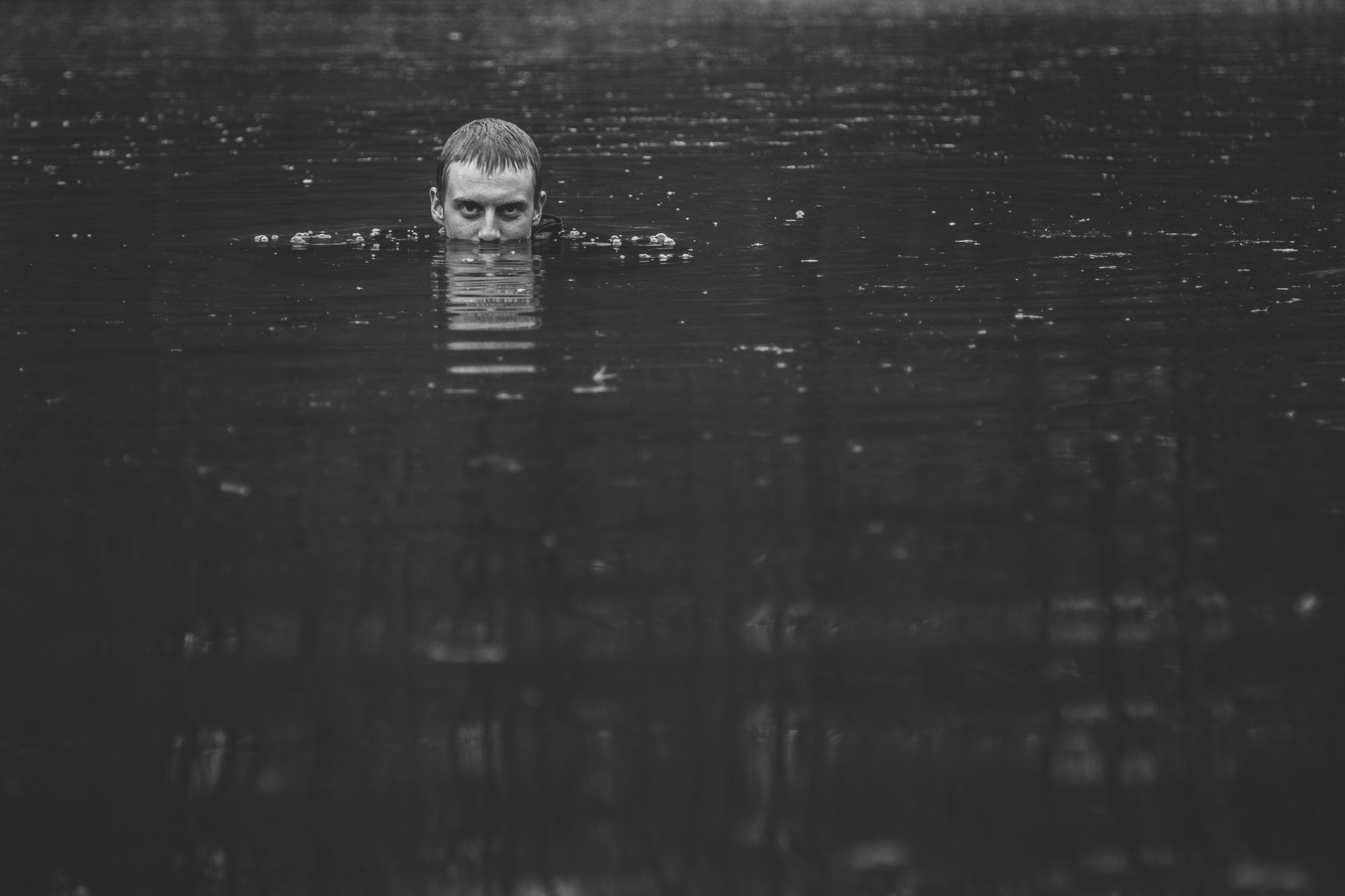
Below is a before and after, showing the extensive work in Photoshop to make the atmosphere eerie and intriguing in this specific photo.

Behind the Scenes

Live by faith & share through fotos.

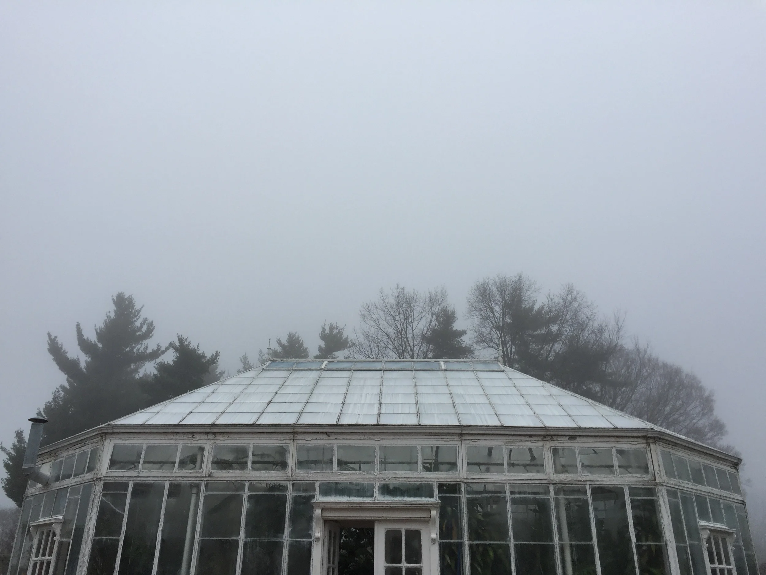
BTS of Out of the Fog: Shiloh Leath (Part 2)
Part 2 of the behind the scenes look at the final shoot with Shiloh Leath for Out of the Fog, focusing on the specific styling, use of fog, editing techniques, and symbolism in final images.
As mentioned last week, this week I would like to share my thought process behind the specific look shared through the tones, use of fog, and other editing techniques in Shiloh's Out of the Fog shoot, along with the symbolism and poetry in her portraits.
Why did I choose specific lighting set ups and editing techniques through tones? For this project, I was highly inspired by the works of Michael Bader, Laurie Bartley, and Jade Mai. Each of these artists' works has a feel of cinematic quality through lighting and editing techniques Their technical skills are combined with symbolism, that is presented through their models and scenes, making them appear significant. By editing in a cinematic type style, it shows that the model is part of a story, and have their own story.
Why is there fog? Fog causes confusion and a loss of sense of direction, which can mean either physically or mentally. Fog can also represent danger as it hides things from us, like truth. So, in this series, the fog is presented as a symbol that represents all the cloudiness and confusion of who the model is, as they are literally coming out of the fog and revealing who he or she is.
So why does her nose appear to be broken or cut? As mentioned last week, through the final images, I wanted to get across every essence of the pain that she has faced, and how she has risen from it. I wanted to present her in a beautiful way as though she has literally healed and risen up to where she is now, although the mark is left behind in a subtle way that may be noticed at first or second glance.
Why did I choose the outfit? Shiloh is a photographer as well, and works with mostly female models in the fashion and fine art categories. I wanted to portray her how she would portray one of her own models, as this art form of photography is so much a part of who she is.
What does the poem mean? The poem reads: "Buried alive/The flesh will fail./Into the fray,/Battle the veil." This poem follows the idea of Shiloh rising from the pain that she has suffered from, and that physically we weaken. For the second portrait of her, I wanted to have her picking up her dress and walking with such intensity as though she were literally about to go into battle ("Into the fray). Shiloh shared with me that she feels very strongly about feminism, therefore "Battle the veil", a veil as it represents female power.
Here are the before and after shots of each image.
Before

After
Before
After
Live by faith & share through fotos.